Work
Ordine
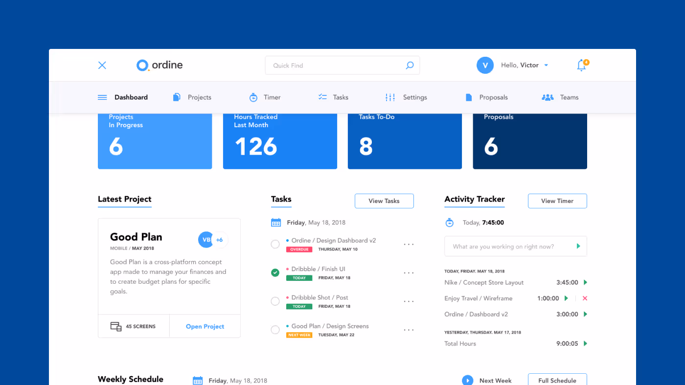
A dashboard to organize design projects
Challenge
There are so many project management apps out there, and I’ve tried a lot of them. The problem is, it’s tough to find one that really fits my needs. Most of them don’t have the specific features I need to track my projects the way I want.
Approach
"Ordine" is an Italian word that translates to "order" and "organization." The project began with simple user stories to map out all the features I wanted, and from there, I created a few screens to explain the concept. My approach was to design a system that allows me to easily organize design projects, track time for automated invoicing, view my schedule at a glance, send and track proposals, link tasks to projects, and categorize projects by type (Desktop, Mobile, Graphic).
Client
Ordine
Year
2018
Duration
2 months
Type
SaaS
Industry
Project Management
Scope
UI/UX
Digital Design
Icon Design
Design System
Digital Design
Icon Design
Design System

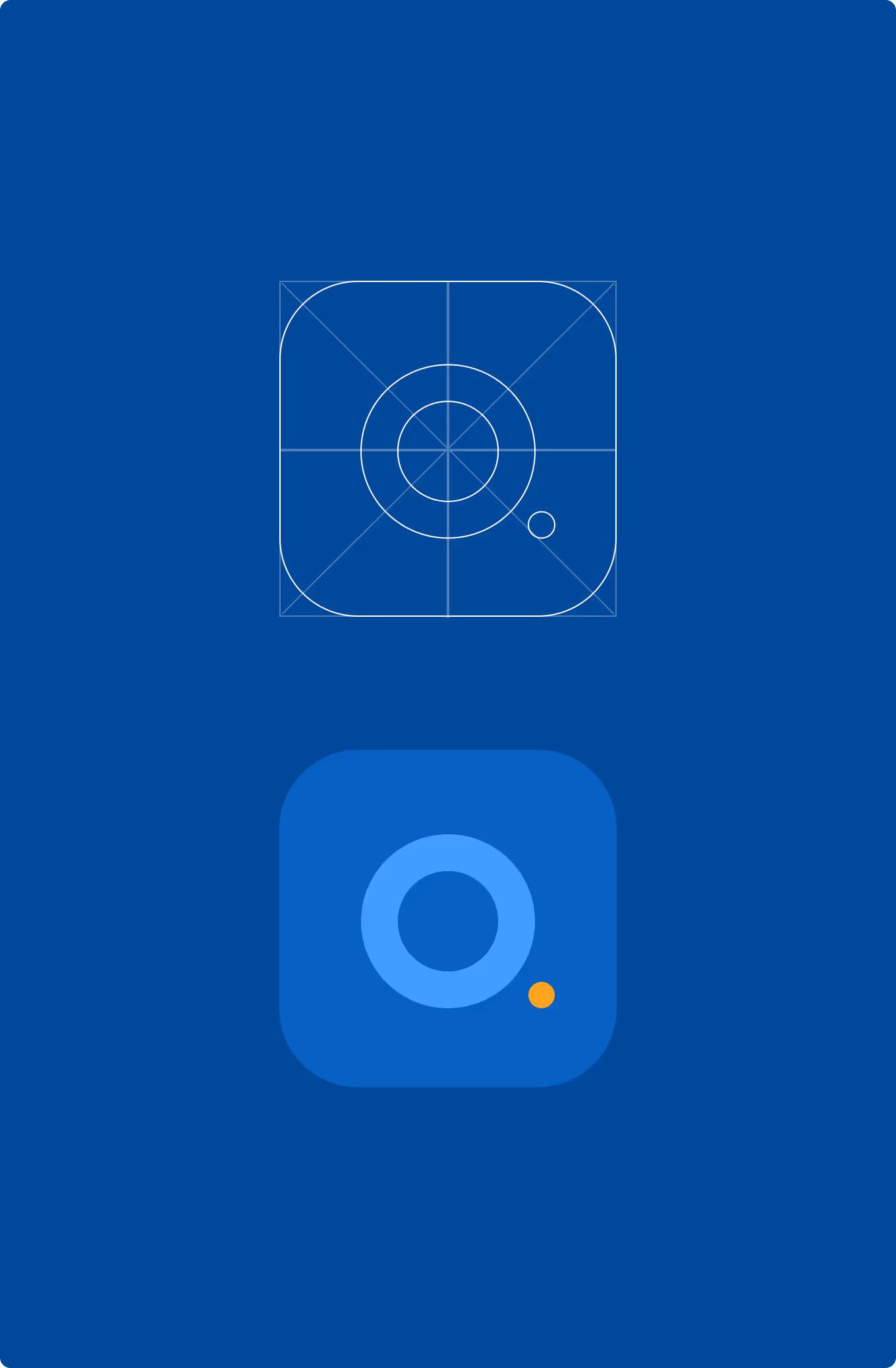
The visual components of Ordine were designed with a simple blue color palette. I also created a straightforward logo that can be used with or without the small symbol next to the typography.
In addition to the screens, I designed a few custom icons and three animations to add a touch of delight. These animations can also be used as secondary elements in marketing materials.
In addition to the screens, I designed a few custom icons and three animations to add a touch of delight. These animations can also be used as secondary elements in marketing materials.


“When I started sketching Ordine, I wanted to create something that would be useful for me and other designers. For the Design System, I focused on the basic components and I also played around with some cool graphics for the cover.”

Victor Berbel
Independent Product Designer


Start a project