Work
Nobe (SaaS)
Making bureaucracy easier and faster
Challenge
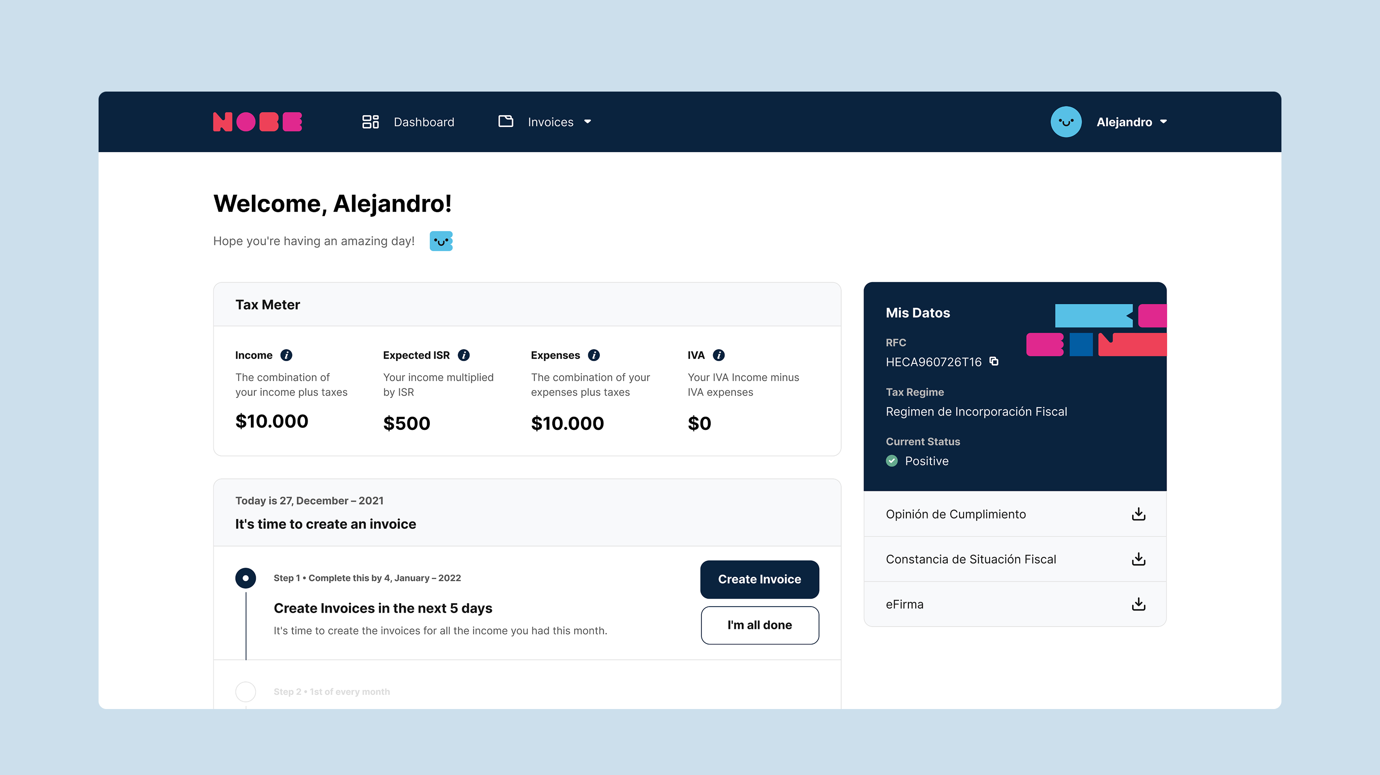
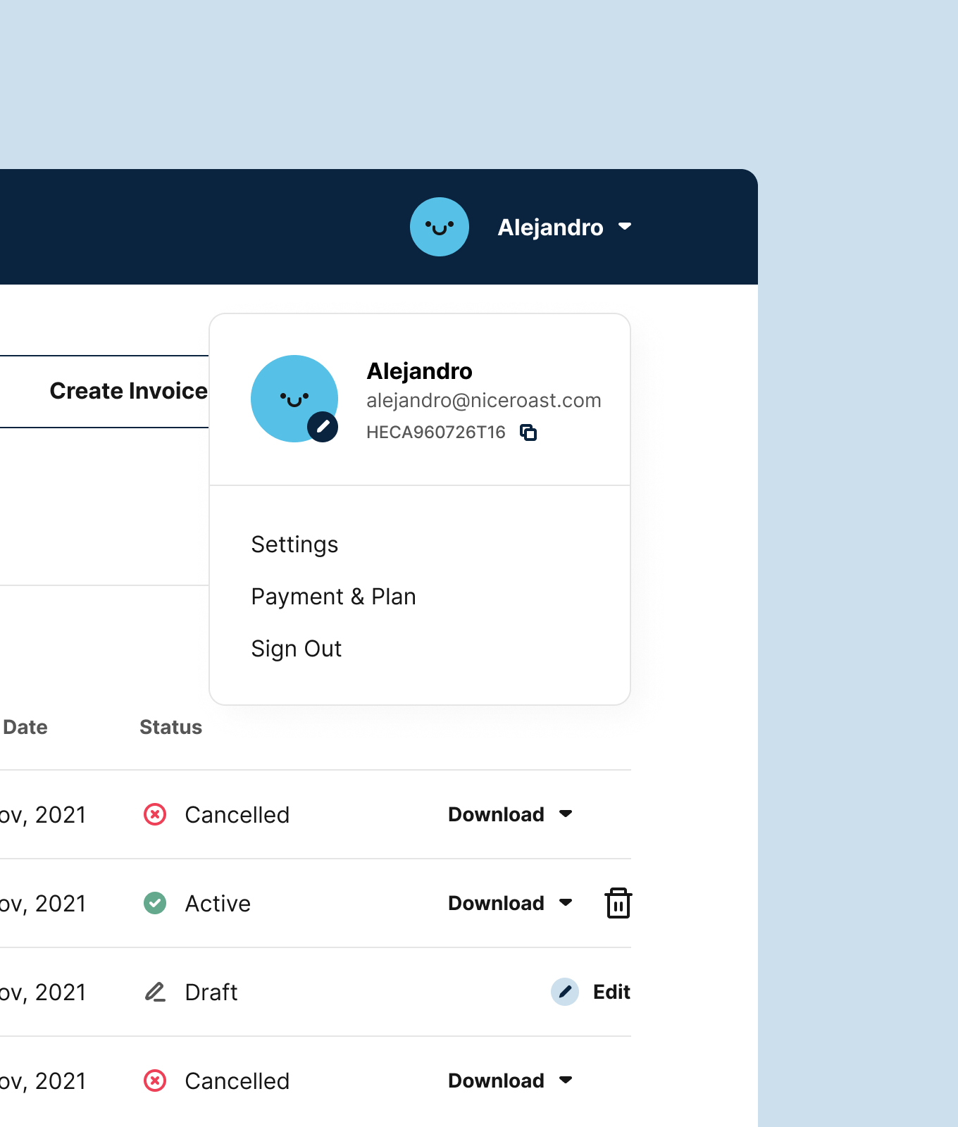
After being hired to work on the marketing website, I was also brought on to design the Nobe product. The goal was to build a platform that made bureaucracy faster and easier for people in Mexico. When I joined, there was already a set of screens done by a junior designer, and my main task was to solve UX issues and get the project ready for handoff.
Approach
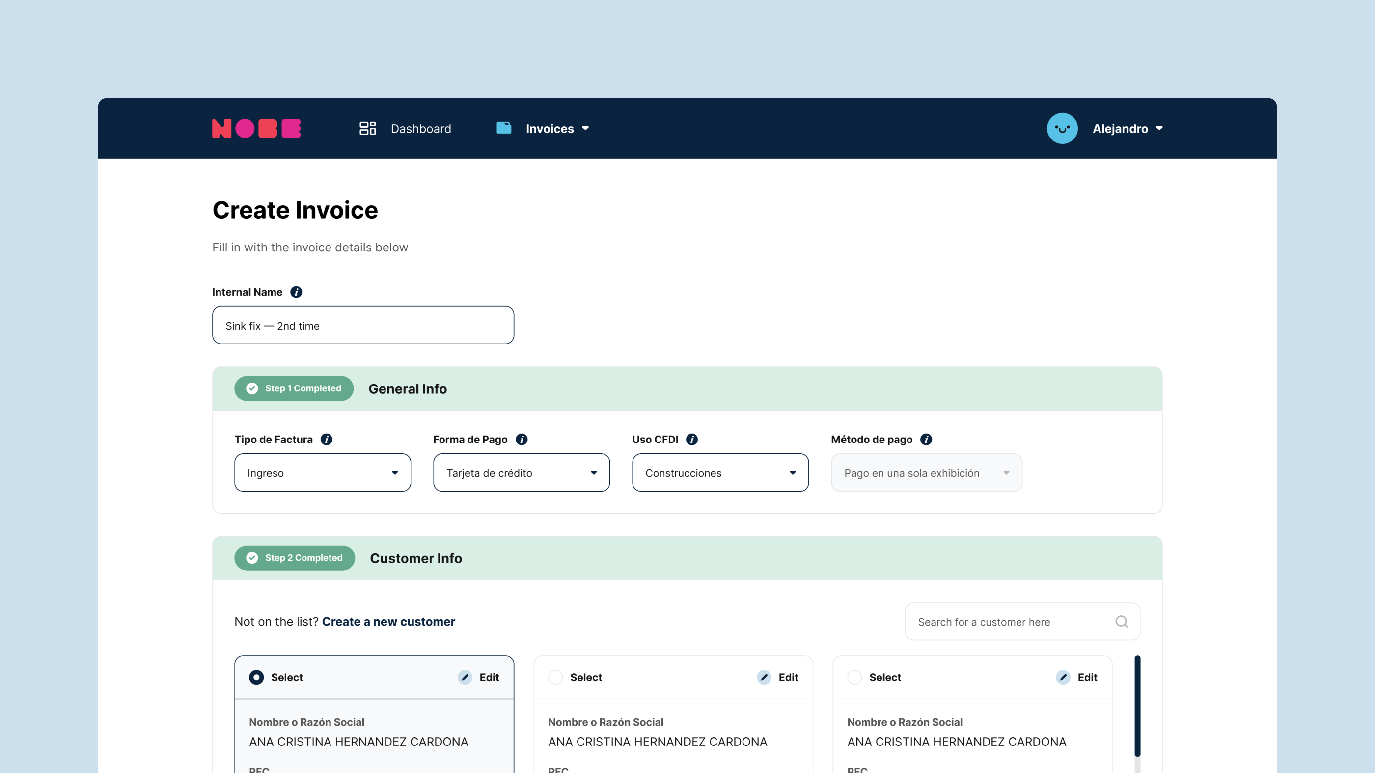
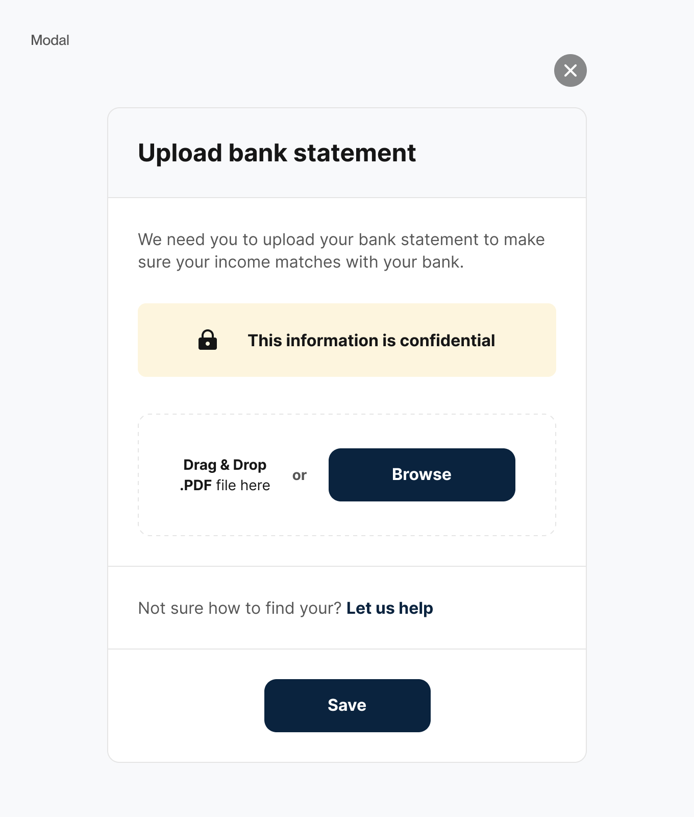
Aside from a few existing screens, most of the documentation was just a PDF. I used it as a guide to build the new ones and had several calls to figure out the more complex UX flows, like creating invoices, adding products, and choosing services. Some of them needed quite a bit of back-and-forth to get the design and usability right.
(Nobe was sold to Guatson and it's no longer active)
Client
Nobe
Year
2022
Duration
5 months
Type
SaaS
Industry
Finance
Scope
UI/UX
Wireframe
Digital Design
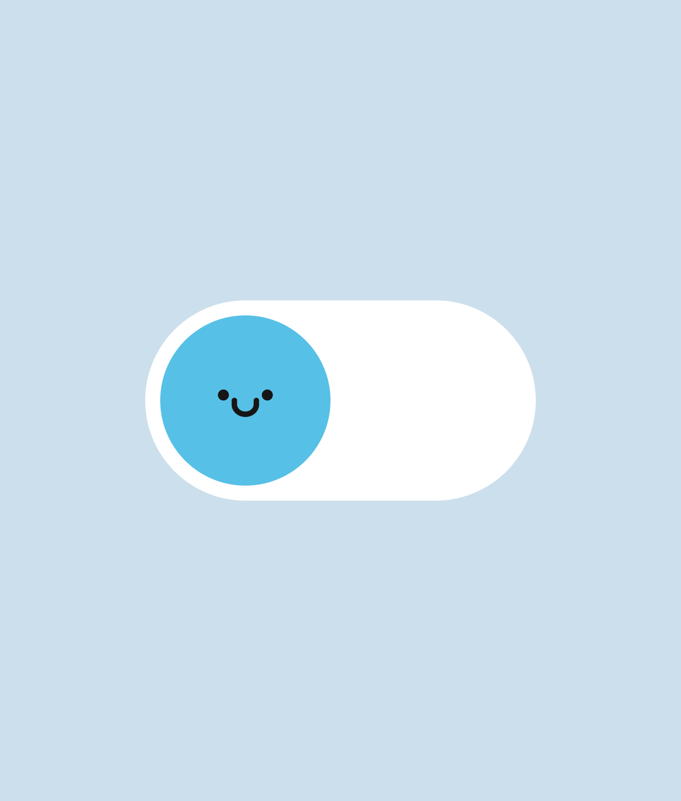
Icon Design
Design System
Wireframe
Digital Design
Icon Design
Design System
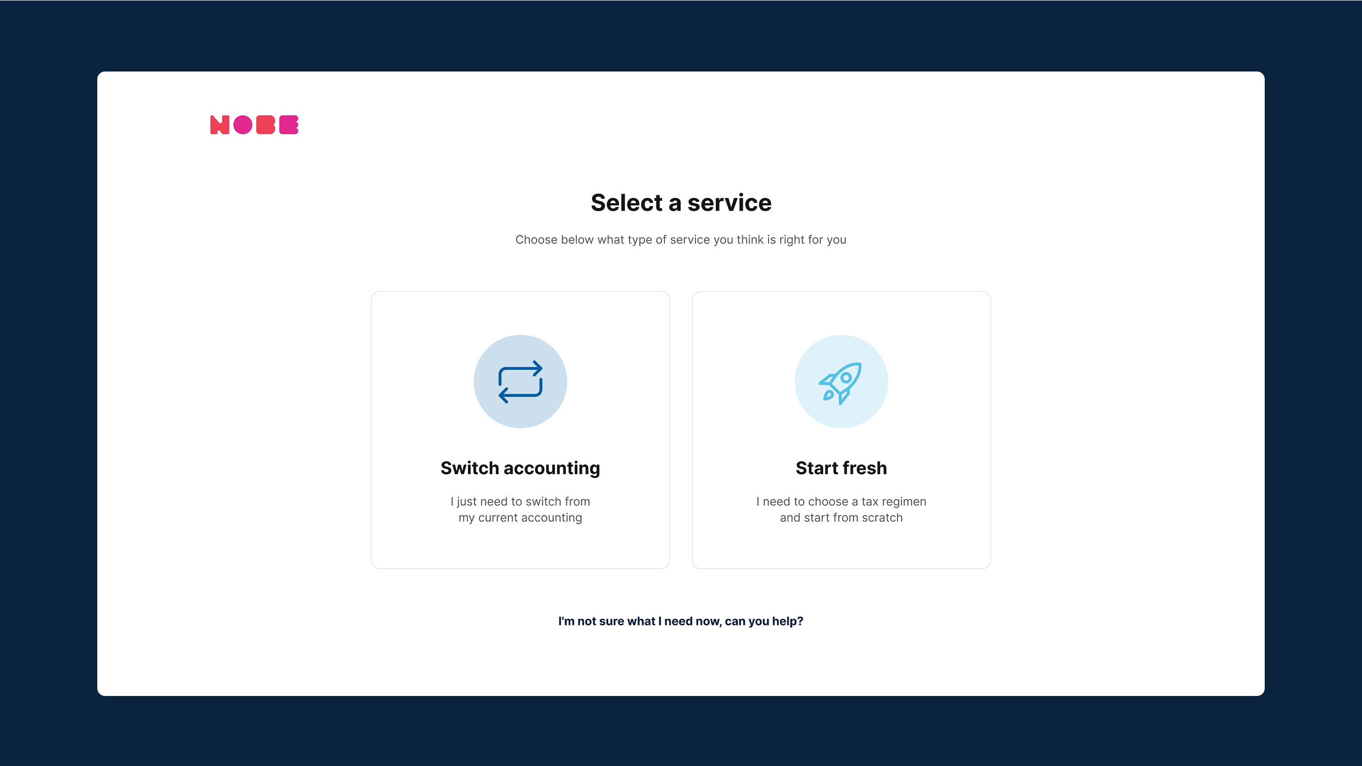
From the start, there were tons of little things to consider when creating a platform that would work alongside a government tool. It was a hell of a challenge to build something basically from scratch, relying only on a text document and the original website to figure out what to fix and what to completely redo.
Throughout the project, we went through many wireframe iterations and had lots of conversations about the UX flows and the nuances of each part of the platform. On top of that, the UI was designed to feel effortless to use and visually pleasant.
Throughout the project, we went through many wireframe iterations and had lots of conversations about the UX flows and the nuances of each part of the platform. On top of that, the UI was designed to feel effortless to use and visually pleasant.


“Victor truly gets your points across and translates it into design. What I loved most was how simple it was to get started, he would clearly state what he needed from me, not wasting my time either.”

Thomas Dobereiner
CPO & Co-Founder, Nobe


Start a project