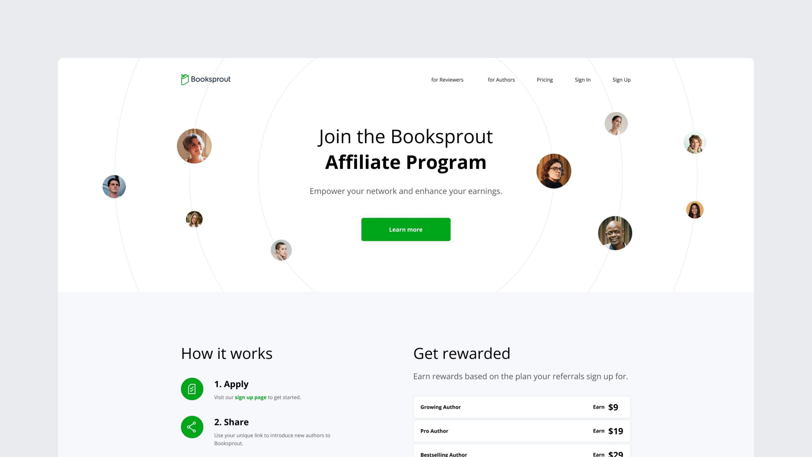
A growing community of authors and readers
Challenge
In my first call with Chris, he shared that the old Booksprout website felt outdated and didn’t communicate the right message. With Booksprout SaaS v.2 launching soon, it was the perfect time for a redesign.
The old site used a generic template, had a wide, confusing scope, and lacked a clear navigation structure. The uniform color palette made the design feel flat and uninspiring.
Approach
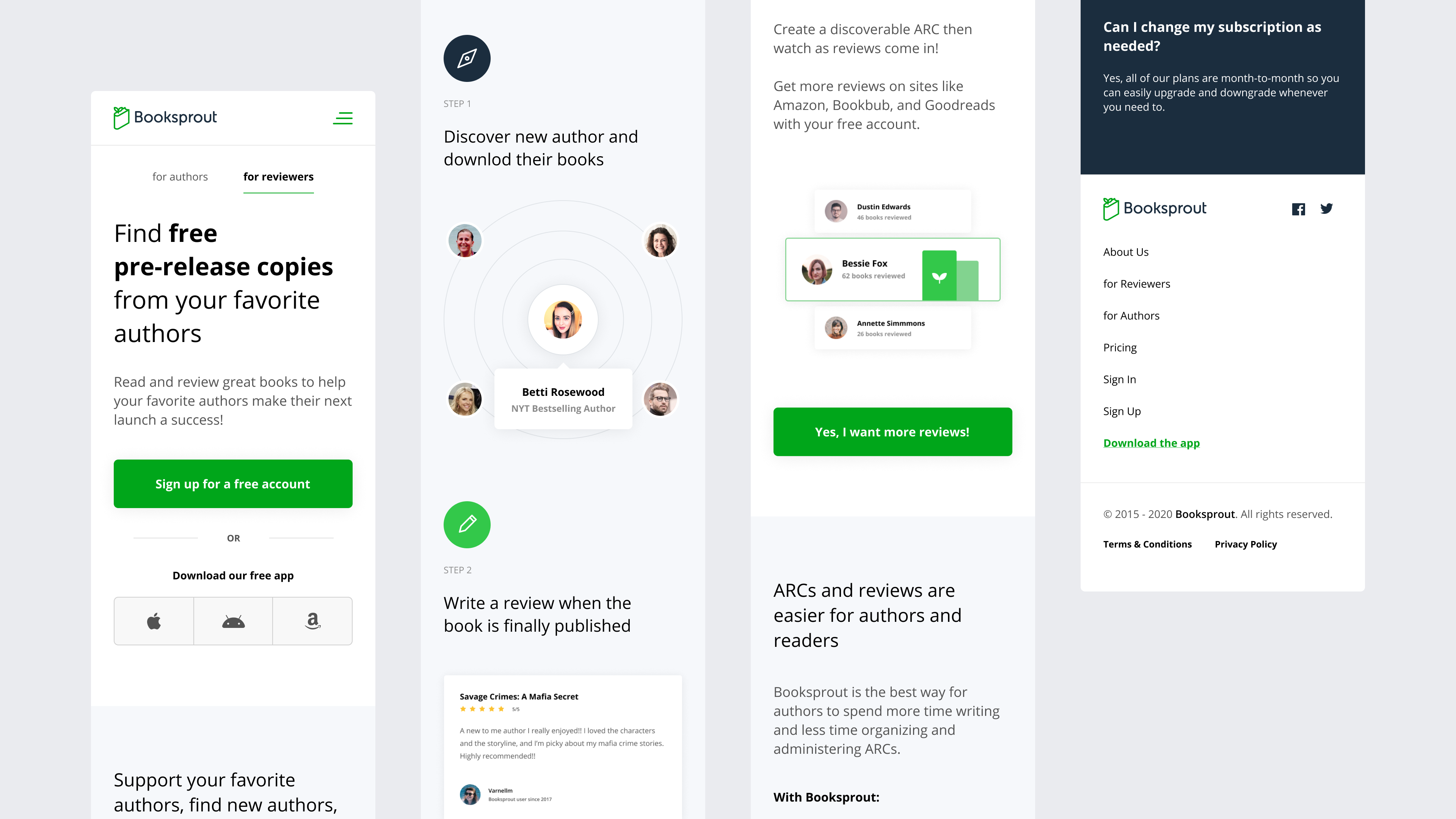
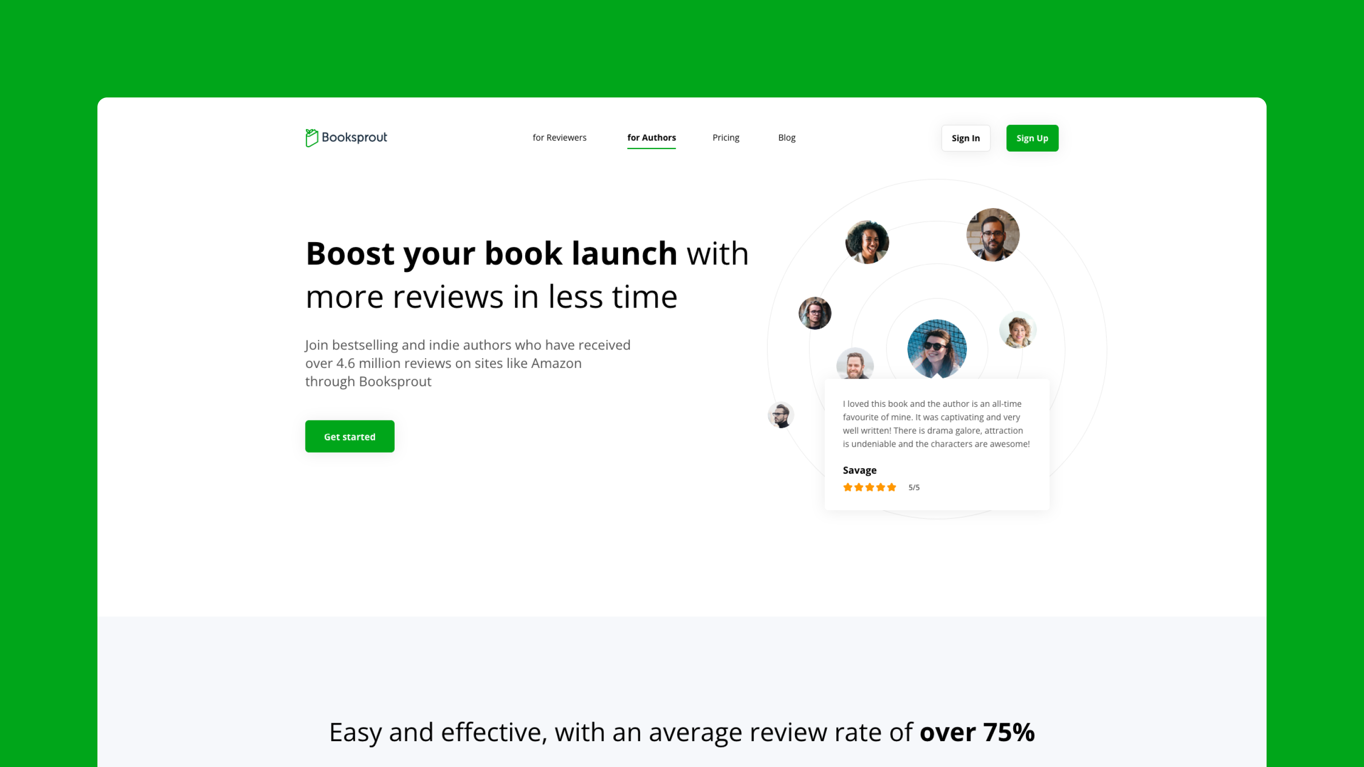
We created a custom design for Booksprout that better aligned with their brand and goals. The team rewrote the entire content, narrowing the scope of the website to focus on the key elements, allowing each part of the project to receive the attention it deserved. A new color palette was introduced, along with unique components to highlight important information effectively.
Wireframe
Digital Design
Icon Design


“Victor produced some really cool designs and he always made sure I was happy with everything before we finished the project. His priority was creating something I liked and I never felt pressured to accept anything before I was satisfied.”